This week we’re featuring work from our web design team: Kaitlyn Gendemann, Ally Kayler, and Dusty Yurkin. From layout design to book covers and greeting cards, this talented team has a variety of experience and skills. Stay tuned for their next creation: the redesign of langaraprm.com!
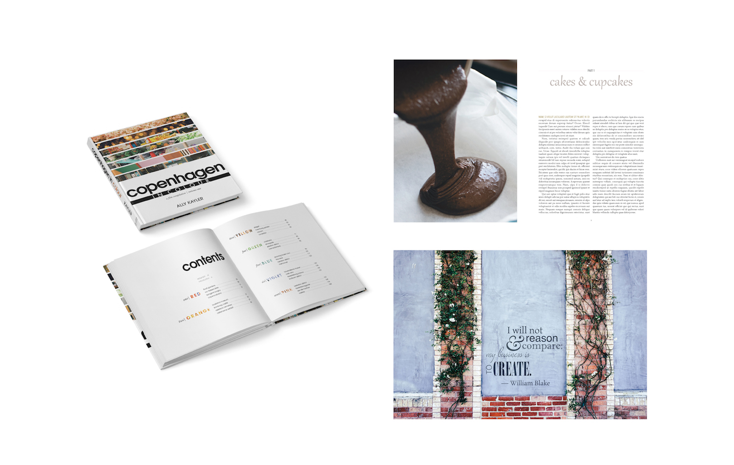
Kaitlyn Gendemann: Book Interior Design
 What about this piece stands out for you?
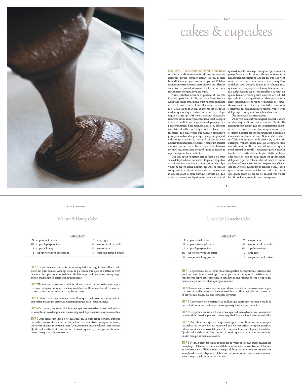
I love typesetting, so creating a piece with a lot of character and paragraph styles was really exciting. Creating a hierarchy with typography can be so beautiful, and it’s amazing to see what can be done with only 2-3 fonts. I also love that this piece was inspired by my sister’s baking business.
Did you encounter any challenges when creating this piece?
I’m not a photographer, so sourcing images was the most difficult task. It was hard to find stock photos of a similar style. It was also difficult to think of all the recipes to include in my table of contents. I wanted to have a full recipe book, but was determined not to use placeholder text for the TOC. Needless to say, I found a lot of recipes that I’ll need to try.
View more of Kaitlyn’s work at kaitlynanne.com.
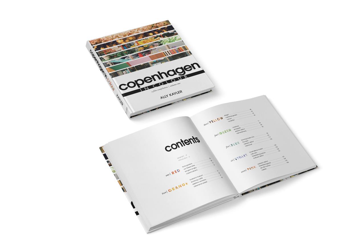
Ally Kayler: Book Design
What about this piece stands out for you?
If you spend any amount of time with me, I will declare my love for Copenhagen. Though Copenhagen is internationally known for its grayscale aesthetic, when I played tourist (4 times in 3 years!), I noticed all the colourful details that added life to the city. I made it a mini project to capture the colour of Copenhagen on my beloved film camera and came home with rolls and rolls of images. When our teacher told us we could make up a book to design, the idea for a “Copenhagen in Colour” coffee table book came to mind. It was so rewarding to translate this idea into a mockup!
Did you encounter any challenges when creating this piece?
The hardest thing to design was the Table of Contents spread. I wanted to incorporate colour, but I didn’t want it to look too childish or cutesy. I love see-through text, and I am glad that I had the idea to use this technique! It carries the images from the cover to the interior in an understated way.
View more of Ally’s work at allykayler.com.
Dusty Yurkin: Greeting Card Design
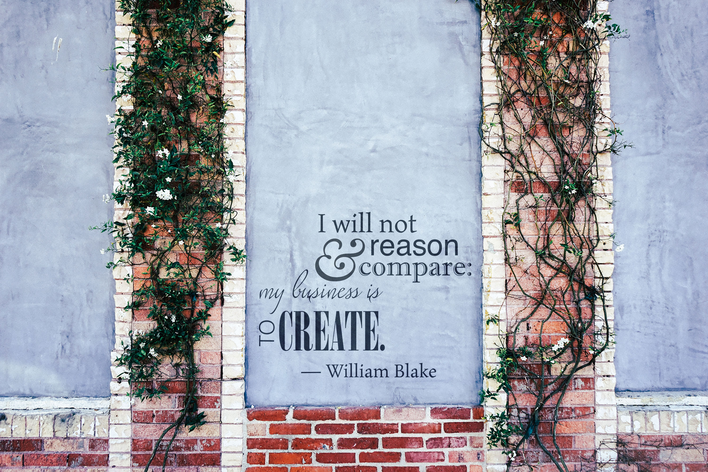
What about this piece stands out for you?
I have always loved quotes whether they are from a movie, poetry, literature, etc., so this assignment was a thrill for me to choose a quote and bring it to life through typography and an image. I have read quite a bit of William Blake, as well as writing essays on his works and ideas, so I knew I wanted a quote by him that was creative. Picking the various typefaces took time, but it was an enjoyable creative process to see which ones fit together perfectly.
Did you encounter any challenges when creating this piece?
It was difficult to find a rights free image that lent well to the overall concept and meaning behind the chosen quote. Many of the images I selected didn’t portray the classic idea I wanted or overpowered the quote, losing it’s importance. Also, if the images were too busy, it was a struggle to have the entire quote show up well and still be readable.
View more of Dusty’s work at dustyurkin.ca.